A lot of e-commerce sellers today are facing a lot of challenges when it comes to build a unique, interactive, and engaging online store.
That’s precisely why you must never fall into the trap of committing the most common e-commerce website mistakes.
Fortunately, there are a lot of ways to optimize your e-commerce website, which could help you streamline your customer fulfillment process. Not to mention that it can help boost your revenues and sales.
In this post, we have listed 12 crucial e-commerce website design mistakes that you need to avoid:
Poor Navigation

One of the main reasons why a lot of people leave your site is because of complicated navigation.
We couldn’t stress this enough: Great navigation is essential in creating a more positive user experience.
If users can’t precisely find what they’re looking for, chances are they’ll simply leave and move on to your competitors. All of this because you didn’t help them find the right page that they’re looking for.
That’s why you need to use an on-site search function and organize your products into different categories. That includes items on individual product pages and other helpful ways to help them navigate through your website.
So, apply the best navigation practices and consider the following things as well:
-
Provide users with top-level categories that are highly accessible on the menu.
-
Allow users to sort out products based on price, review scores, etc.
-
Anything clickable on your site should be big enough to be used on your smartphone and other mobile devices.
Complicated Checkout Process

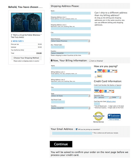
Having a long and complicated checkout process is one of the most damaging mistakes an e-commerce website could ever make. The thing is you need to make it as easy as possible for customers to hand over their credit card information and complete their purchase.
The more steps that it takes before they can buy a product the more likely they will abandon their cart.
Ideally, your checkout page should only be a single page, wherein customers can check the items they added on their cart, as well as input their name, delivery address, and payment details. The next pages should be about confirming their customer information and hitting the “Buy” button.
Anything else that you place in between is already considered as an obstacle for them to complete their order. So, follow this ideal model as much as possible.
If you have to place other pages, then make it easy to fill-out. Use two-column layouts for particular sections to make pages appear a lot shorter.
Not Giving a Clear Value Proposition
Another factor that will determine whether a customer will keep coming back to your site (or never return) is your value proposition.
Your value proposition will characterize how engaging the quality of your product is to your prospective buyers. It will help showcase the unique features of your products and brand, which will allow you to stand out from the rest of the competition.
Your value proposition will persuade buyers why they should spend their money on your products or why they should buy them in the first place.
Here are some essential characteristics of a reasonable and persuasive value proposition:
-
Appealing and engaging content that will showcase the advantages of using your products and will convey your brand message.
-
Stunning photos that will showcase and describe how to use your product.
-
Other advantages like exceptional rebates, free delivery, and so on.
Slow Loading Page

The average time it takes a page to load is less than three seconds. Anything more than that and you risk your website having a whooping bounce rate.
There are a lot of factors that could affect the speed of a website, and that includes internet speed, hosting server, the content of the page, images and videos on the website, and so on.
Now, among these factors, the most prominent one is web design. That’s because this may require some rework if you consider page speed. So, make sure that your site loads as quickly as possible, as this can impact your search engine ranking.
Fortunately, sub-standard load times can be fixed. In the end, it’s all about resizing and recompressing your product images. While high-quality photographs look great when printed, some are bigger than necessary, especially if you use them on your site.
Poor Quality Product Photography

They say that a picture is worth a thousand words. But if it’s a grainy, low-quality photograph, this might cause you to lose out on conversions and sales.
Great product photography goes beyond just providing customers basic information on what a product looks like.
Ideally, it should pique the customers’ imagination so that they could envision what the product will look like if they use it. Similarly, it can also provide them with contextual flavour and understand the product aesthetically.
Since most people already have high-quality digital cameras on their phones these days, there’s the very little excuse why you shouldn’t represent your products with high-standard imagery.
It’s also a great idea to be more creative with your product photography. You don’t have to restrict yourself with photos of your products with boring white backgrounds.
You can make it interesting to your prospects by using a unique background or using the image in a surprising, engaging context.
Confusing Product Description
Product descriptions are one of the most important aspects of an e-commerce site. It will help your customer understand everything related to the product and why they should buy or use it in the first place.
Check out our guide on How to Create Product Descriptions that Sell
Burying the CTA Button
When a customer lands on your product page, the first thing that they should immediately see is the “Add to Cart” button.
CTA buttons should always be the most noticeable on your page.
However, take in consideration that some sites will give complex attributes and product descriptions to provide users with all the essential information before a user can make a purchase.
While this could pave the way for users to have more informed decisions before purchasing, this creates unnecessary confusion as to what action to take on the page.
Is it designed to be an informational page, or can products be purchased there?
So, while providing a comprehensive and lengthy product description is important, it should not have to be displayed in full all the time. Rather showing the entire description, shorten the copy and add a more visible CTA button.
Signing In Before Making a Purchase

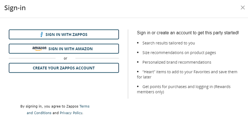
It could be such a hassle to force your users to sign in before they make a purchase. Almost everyone hates to be asked to do something, especially when they don’t want to do it.
Hence, some users will rather opt to leave before they do what they want them to do, which is to buy a product immediately.
So, try to make things more flexible for your customers by letting them purchase products without needing to sign in to the system. Over time, if they really love your brand and what you have to offer, they will voluntarily sign in.
Even if they don’t, the fact remains that they’ve purchased from you. And you can leverage it to turn one-time buyers into loyal, repeat customers.
Choosing the Wrong Hosting Platform
Your website is the very foundation of your business and is a reflection of your brand. If you choose the wrong hosting platform, you’ll be setting yourself up for disaster.
In choosing the best hosting platform, to consider the following:
-
Check if they have payment methods that can be integrated with mobile commerce.
-
See how much control you have over your online store.
-
Check if there are drop shipping options or third-party options.
-
Check for software and hardware limitations.
No Social Engagement and Reviews
These days, if you want to have a solid customer base, you need to have a strong following and lively social media pages.
Incorporating social media on your website allows you to build confidence in your community, enhance traffic, and boost your SEO efforts for your e-commerce site. So, ensure that you keep your social media buttons visible.
Not Mobile-Friendly
According to data by Statista, more than half of the traffic from the internet now comes from mobile devices.
With a majority of users viewing your store from their smartphones and other mobile devices, it’s important to have a mobile version of your site that works well with small screens.
Poor Customer Service
Customers are crucial for your growth. But retaining them isn’t easy, especially if you have bad customer service.
Poor customer service can destroy the reputation of your brand that you have built for years.
In relation to this, customers would want to resolve whatever issues they encounter as quickly as possible. So it would be better if they could contact you through various channels with ease.
That’s why every e-commerce site out there should have impeccable customer service.
It’s common to commit mistakes when building an online store. But with our list above, we hope that you were able to understand how it can negatively affect your business, as well as how you can avoid it. Good luck!


